Designing for behaviour change, measured in metrics.
A year of tests on a telematics product — how friction, feedback and honest system status changed what customers actually did.
Context
What is telematics car insurance?
Most car insurance is priced on who you are: your age, postcode, driving history. Telematics prices it on how you drive. After buying car insurance, customers receive a small device in the post that sits in the car and pairs with their phone. It records each trip — braking, speed, phone use — and turns it into a score.
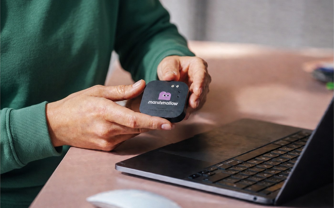
After Marshmallow launched telematics insurance in December 2025, the real work started. Customers were buying it, but buying was only the first step — they also had to install a tag, drive with it, and drive well.
That makes it an unusual product to design for. We weren't only selling cover; we were asking people to take an action after the sale, repeatedly, in a car, weeks later. The business case depends on it: a customer who buys telematics and never drives with the tag is worth less than one who never bought it, because we can't price their risk and they're more likely to cancel.
Soon after launch, metrics, customer feedback and customer interviews showed us there was a lot to improve in our customer experience.
Here are some of the changes and tests we launched over the last year. These were all measurable tests, built around a simple question:
What would make the right behaviour the easy one?
Test 01 — Adding friction at quote
To help people understand what they were buying before they paid for it.
The problem
In the quote flow, we presented telematics as a cheaper option with very little explanation. Low friction meant high uptake, and high uptake looks good until you follow the cohort. Tags weren't being installed, and customers were contacting us to switch plans or cancel in the first week. We were converting people into a product they didn't realise they were buying, and then paying for it downstream.
How we fixed it
We added friction on purpose. In customer interviews, people genuinely didn't realise a tag was coming. My bet was that a short, deliberate pause at the point of commitment would cost us a few sales and win back more in customers who stayed.
We introduced a modal after the quote and before payment — the moment of commitment — confirming that this cover comes with a tag, what it does, and what it saves you. Framing the saving as a benefit was crucial, and I tested it many times, to reduce drop-offs and mitigate the risk to conversion.
The impact
- First-week cancellations fell from 10.8% to 8.9%
- Fewer customers switching to telematics just for the price — its share of sales fell from 34% to 27%
- Against non-telematics customers, the variant also performed better commercially: +7.4% volume, +5% net premium
The modal was rolled out to 100% of customers in that channel.
Friction isn't the enemy.
A step that slows someone down isn't automatically a cost. Here it helped people understand what they were buying, which prevented cancellations — and our net premium still went up.
Test 02 — Feedback after a trip
To influence and improve driving behaviour.
The problem
Now that more customers were installing and driving with the tag, we looked at their driving scores — and a surprising number scored badly. They were driving without paying attention and braking too often and too harshly, or they simply didn't know what was causing the bad scores. The score sat quietly in the app, disconnected from the moment it was earned.
Was everyone a bad driver, or were we lacking in communication?
How we fixed it
We introduced notifications sent right after a trip was completed.
Behaviour changes when feedback arrives close to the action: a notification after the trip attaches the score to something the driver still remembers doing. According to behavioural science, rewarding positive behaviour builds lasting behaviour, and reward outperforms warning — telling someone what to do next teaches a behaviour, while telling them off only teaches them what to avoid and leaves them to work out the rest.
We launched three push notification campaigns:
-
Positive reinforcement
Sent after 5-star trips: "That was a 5-star trip! No phone use, smooth braking, no speeding. Keep it up."
-
Harsh braking alerts
Each paired with one concrete thing to do differently, like the 2-second rule.
-
Phone use alerts
Written in two tones, so we could test how hard to push.
The impact
Fewer drivers got worse, too (15% vs 26.5%). Across 59k notifications and 500k+ trips:
- Phone use detected on 15.5% → 13.1% of trips (−15%)
- Harsh braking 23.4% → 21.8% (−7%)
- Speeding 6.1% → 5.7% (−6%)
- Open rates of 26–34%
The result I didn't expect
The harsher copy — warning that phone use may affect your policy — didn't perform better than the softer approach, which simply explained the risk. That settled a debate, and proved that in some cases you don't need to be forceful to drive behaviour change. It's one of the design principles I stand by.
Test 03 — Fixing tag connection
To increase tag connectivity and reduce tag replacement.
The problem
Customers kept contacting support to say their tag wouldn't connect. In most cases it was connected.
The tag pairs automatically in the background, which can take minutes or days depending on signal. But the app only confirmed the connection if it happened instantly. When it didn't, the customer was left on a loading screen that read as failure, so they tapped "I need help" and reported the tag as broken.
Over three months: 40+ support tickets, replacement tags shipped unnecessarily at £15 each, and live chats that opened with no context.
We couldn't say how many tags were faulty and how many had simply never been used, because the only signal we had was trips, not connection. When we dug into it, only around 1.6% of policies actually had a broken tag. Looking at the wider data turned up something nobody had been tracking:
How we fixed it
Connection can take seconds or days, so we stopped showing an instant confirmation altogether. The new flow covers only what the customer controls — turning the tag on and sticking it in the car — and explains plainly that the tag will pair by itself once they start driving. If they do start driving and don't see a trip, they can now report it in the app.
-
Animations
Showing exactly how to press the button and what the light should look like.
-
Context on each screen
So people know when pairing actually happens.
-
Explainer modals
For self-troubleshooting, or reporting a tag that isn't recording.
The impact
This launched in September 2026, so it's too early for results.
Learnings
I'm fascinated by how much small changes can do when they're well thought out — when they're transparent, grounded in design principles, and put the customer at the centre of the decision. I love watching the metrics and learning from people's behaviour, and that only happens in an environment where changes, improvements and tests are welcome.
Behaviour is the metric.
Conversion, cancellations, support cost and activation are all just records of what someone did or didn't do. Designing for the behaviour is how you move them, and it's a more reliable lever than optimising the number directly.
Friction isn't the enemy
A step that slows someone down isn't automatically a cost. When it helps them understand what they're buying, it prevents the cancellations and support contacts you'd pay for later.
Test the assumption, not just the design
We assumed a harder message would work harder. It didn't — and knowing that changed how we write to customers.
Small tests add up
None of these was a big redesign. Together, they moved customers from buying telematics to actually driving with it, and driving better.